We continue our article series with London-based agency Turquoise Branding centred around branding in esports. Turquoise has helped with the branding of projects such as UEFA’s Europa League, game developer MY.GAMES’s consolidatory rebrand, and Channel 4’s reality-show hit The Circle. Collectively, the agency has over 30 years’ experience in sport, motion and design, and entertainment media.
Esports Insider sat down with Gareth Mapp, Creative Partner of Turquoise Branding to apply his expertise in developing brands to esports. In January, our conversations revolved around the core principles of branding applied to esports. This time, Mapp focused on league and tournament branding.
Branding leagues to be legendary
UEFA, or the Union of European Football Associations, is the European confederation for global behemoth FIFA. Riot Games’s LoL Esports operates in a similar fashion to FIFA, according to an interview with Riot’s David Higdon, Global Head of Communications, Esports.
At base, both FIFA and LoL Esports support regional leagues (Europe, Latin America, North America and so on) with clubs competing at regional levels and global championships. Each league is run by an operator, often running multiple tiers of leagues in the same (e)sport.
RELATED: The core principles of branding applied to esports: Turquoise
For example, UEFA operates tier-one UEFA Champions League, tier-two UEFA Europa League, UEFA Women’s Champions League, among others. It is up to the operator to brand and market these leagues.
For UEFA, each league has its own branding, sponsors, and audiences segments, explained Mapp. Many esports TOs and leagues operate in a similar structure. But what Mapp calls the ‘brand packaging’, or how it is presented and visually conveys what it is, isn’t there yet for esports.
But it’s getting there. Both Riot Games and Activision Blizzard have gotten the memo, contracting externally for branding and design projects. In the past three years, LoL Esports has rebranded itself, a quarter of its regional leagues, and introduced VALORANT esports’ VCT branding — all of them executed with external help.
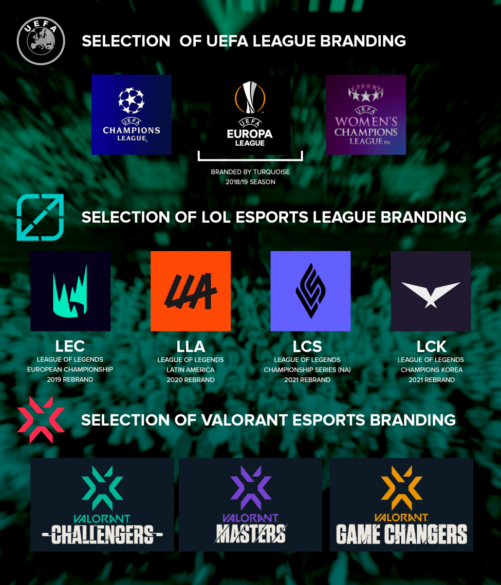
Given the visual identity direction of the new LCS and LCK, less recent LEC and LLA, and even VCT — the trend of flat-icon (re)branding demonstrates the visual language that Riot esports seems to be going for. Mapp said that this ‘flattening’ is part of a sweeping design trend happening outside of esports, too.
He explained this as brands simplifying their logos for easier recognition as social media profile pictures. The less going on and the more contrast, the easier it is to recognise. It’s branding with the digital experience kept paramount.
Outside of the visual aesthetics of logos, Mapp outlined different organisational structures to consider. He detailed two different branding approaches popular with large-bodied league operators in traditional sport.
The House of Brands approach allows each league brand to be its own entity, but the parent company gets the bill of an increased workload in managing various brands. To be effective this way, exclusive managers and teams are needed to take charge of each brand. The costs add up, but it buys flexibility to target diverse audiences and/or sponsorships for each brand.
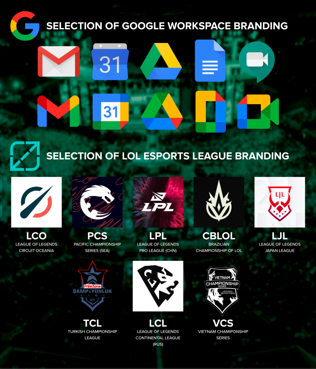
The Monolithic Brand approach, on the other hand, is more cost-effective to run. For example, with Google Workplace — Google Drive, Google Sheets, Google Docs, and so on — all aspects are branded together and thus brand guidelines, identity, and tone of voice are easily shared.
A few important factors can be decided by a handful of people for the entire brand. Where this method saves on costs, it sacrifices its ability to diversify its offerings, adapt quickly to opportunities, or break itself away from the image or perception of the parent brand.
Shining in their own light
Esports leagues aren’t strangers to these branding models, but most large companies end up assuming a hybrid model of the two. LoL Esports league branding leans more toward a House of Brands model, Mapp said, by allowing each regional league to develop their own personalities and branding. In one-fourth of league names, for example, ‘League of Legends’ is omitted entirely.
This asymmetric approach likely evolved from Riot building their esports rocket while it was in the air, but it seems to be working for them. Mapp explained that UEFA, over the course of 60 years, needed a strategy for implementing new leagues, which informed their House of Brands approach.
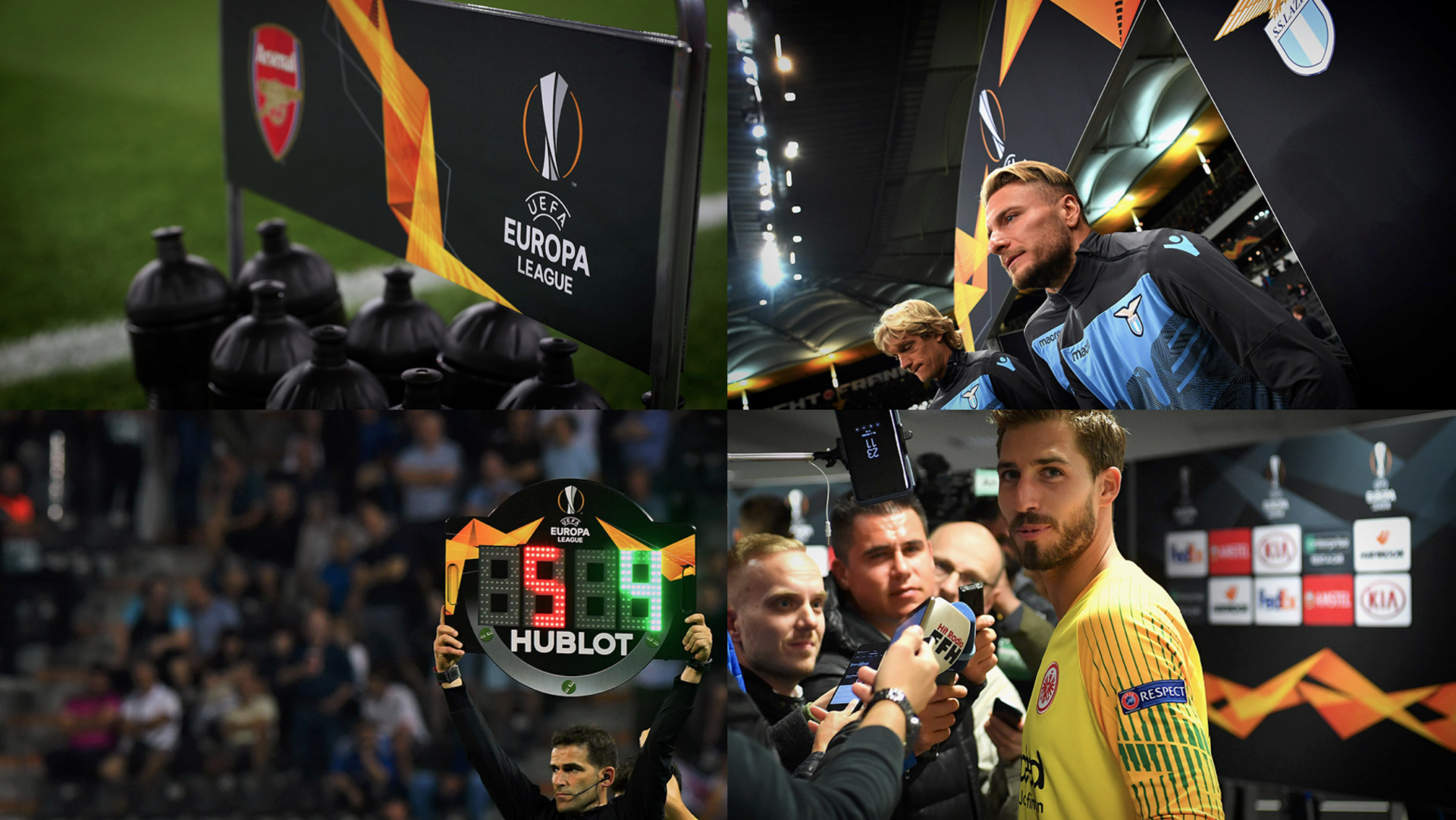
The work Turquoise did for the Europa League rebrand for the 2018/2019 season, fundamentally, is no different than the work done for LoL Esports league rebrands. Mapp took inspiration from the iconic Europa League trophy. Its triangular sides and tactility of hammered metal informed the shape and texture of the energy wave, becoming a symbol for the trophy; the smoke to its fire. The energy wave became the visual identity of the Europa League, its realisation being the trophy.
Design thinking and processes like these are what can be built into branding when things have been thought out. That’s what branding agencies specialise in. That’s what organisations pay the big bucks for.
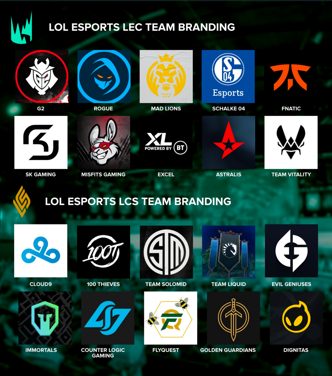
Visible diversity between each league’s identity alleviates some need for conventions, such as naming or symbolism. “You can dial up the personality of the leagues more,” Mapp said, “and add more uniqueness to the individual aspects of each league.” But this also raises the difficulty of understanding for newcomers. A glance at the line-up of LoL Esports’s top-tier leagues won’t convey much to the uninitiated. Add in all the team logos and any visual cohesion is lost, Mapp agreed.
Everything in its place
Massive organisations, both new and old, seem to prefer the Monolithic Brand method, attaching their parent name to every product and service and absorbing new acquisitions. Esports orgs also tend to favour this approach; each team, regardless of which title it competes in, touts the org’s name, save for orgs in the OWL and CDL.
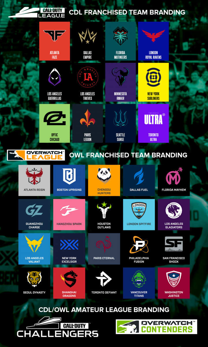
Both the OWL and CDL require competing orgs in their franchised slots to brand their teams according to league guidelines, resembling location-specific naming conventions of traditional sports. This creates a clear association between team branding and league branding, not to be confused with other esports leagues. A more stereotypical corporate identity, but at a glance, much more can be inferred from the brand cohesion.
Whereas Riot built their rocket in the air, Activision Blizzard crafted a blueprint before launching their esports programmes — and it shows. A glance at the team branding per league offers a recognisable design convention — with a few exceptions — bolstering the cohesion of the monolithic leagues.
[primis_video widget=”5183″]RELATED: 2021 Esports Awards unveils rebrand and partners
For Turquoise, the key to top-tier branding is flexibility, adaptability, and cohesion. And for leagues, on the pitch or on the screen, professional branding help can be the edge in helping them enter a league of their own.
Created in collaboration with: Turquoise Branding
[maxbutton id=”18″ ]
