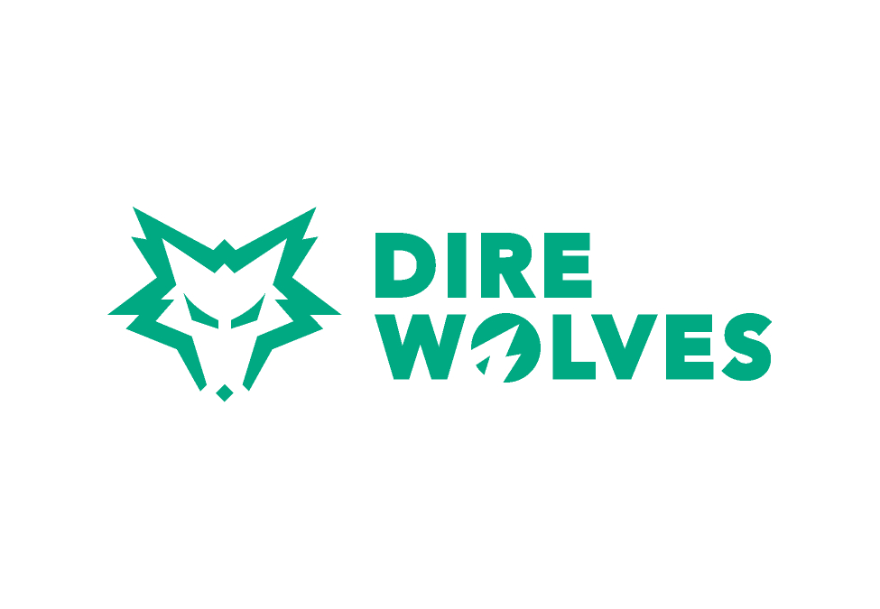
Oceanic organisation Dire Wolves has unveiled new branding, including an entirely new logo, as part of a period of major expansion for the company.
Esports Insider spoke with Dire Wolves owner Jason Spiller, the head of a new management team at the organisation announced just yesterday, to glean more information on the strategy behind the rebrand.

RELATED: Dire Wolves names new management ahead of major expansion
Accompanying the new branding is a new ethos, described in a release as “playfulness, ferocity, an elite approach to performance, and a collaborative and inclusive community, embodied by the wolf pack.”
Speaking to Esports Insider, Spiller shared more insight on the “really interesting journey” behind the organisation’s rebrand. “We looked at a lot of things, first up: what really the essence, or the core of the Dire Wolves is—and that was something that I really wanted to continue to maintain because there is such a power in that logo, that concept and that idea, that name,” he said “And it’s held by all of our fans in really high regard as in a strong leadership position, especially in ANZ.”
[primis_video widget=”5183″]
RELATED: LG Australia renews Dire Wolves sponsorship
Spiller continued: “We really needed to find and distill that tone of voice and what really made the Dire Wolves, the Dire Wolves. And in a week, we came really to three main concepts around the Dire Wolves: being fierce—being confident, purposeful, intense, which all of our teams are. Being elite—the fact that we have really tried to push all of our players to be the most skilled, the most talented that they could, and really be among the best.
“It also that concept of wolf pack, that everybody is loyal and respectful and that the wolf pack is a really collaborative community environment. It’s open to everyone, it’s really inclusive.”
Its release comes during a week of major reveals for the Dire Wolves, which is expected to announce an entry into a new series of games later this week.
Esports Insider says: While the classic Dire Wolves logo is synonymous with the history of Oceanic League of Legends, there can be no doubt that the new design is a much cleaner modernisation of the brand.
[maxbutton id=”4″ ]
