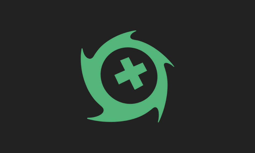
New England-based esports organisation Oxygen Esports has unveiled its new branding that aims to overhaul all parts of its visual identity.
Inspired by the ‘duality of nature’, the new branding connects all of the company’s franchises and assets under one global brand. The main colour of the organisation remains green.
Oxygen Esports is a North American esports company that owns the Boston Uprising in the Overwatch League, as well as the Boston Breach in the Call of Duty League. Apart from those franchises, Oxygen Esports has teams in Rocket League, Rainbow Six: Siege, VALORANT and Apex Legends.
The organisation merged with the Boston Uprising in 2021, allowing the company to compete in the Call of Duty League.
The new brand keeps green as the main colour, but changes its shade to a more pastel hue. The base of the logo is an X symbol which, according to Oxygen connects the company to the Boston Breach branding, and also as the centre of the ‘storm’ symbol in the logo.
Oxygen noted that the logo is designed to be shaped like a hurricane or a storm.
Oxygen Esports joins an evergrowing list of esports companies rebranding in 2023. This includes the likes of Dplus KIA, Misfits Gaming and LOS, among others.
Oxygen Esports Co-Founder and President Murph Vandervelde, commented: “We feel our new branding encapsulates how much we have grown and connects our new franchises, the Boston Breach and Boston Uprising, back to Oxygen.
“From our humble beginnings as a scrappy upstart in Rocket League and Rainbow Six, to now competing in the most coveted esports leagues on planet earth against tier one organizations it has been a wild ride. “
