More than just having moved ‘out of the basement’, esports organisations have rapidly matured, and their business models have evolved alongside the industry’s growth in recent years. To symbolise these changes, updates to branding often follow.
But branding in the sector shares a quality with high-performance gaming monitors: a high refresh rate.
Just in the past year, Esports Insider has reported on over a dozen high-profile rebrands in the esports industry, from parent groups and teams to league and event operators.

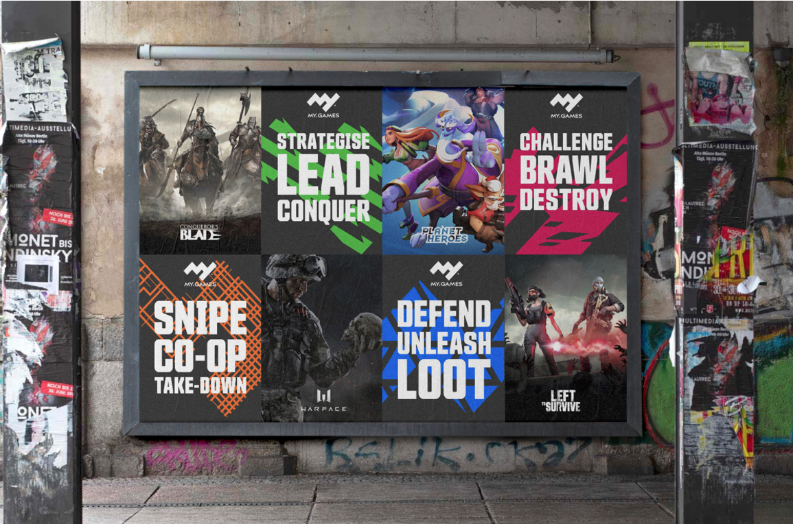
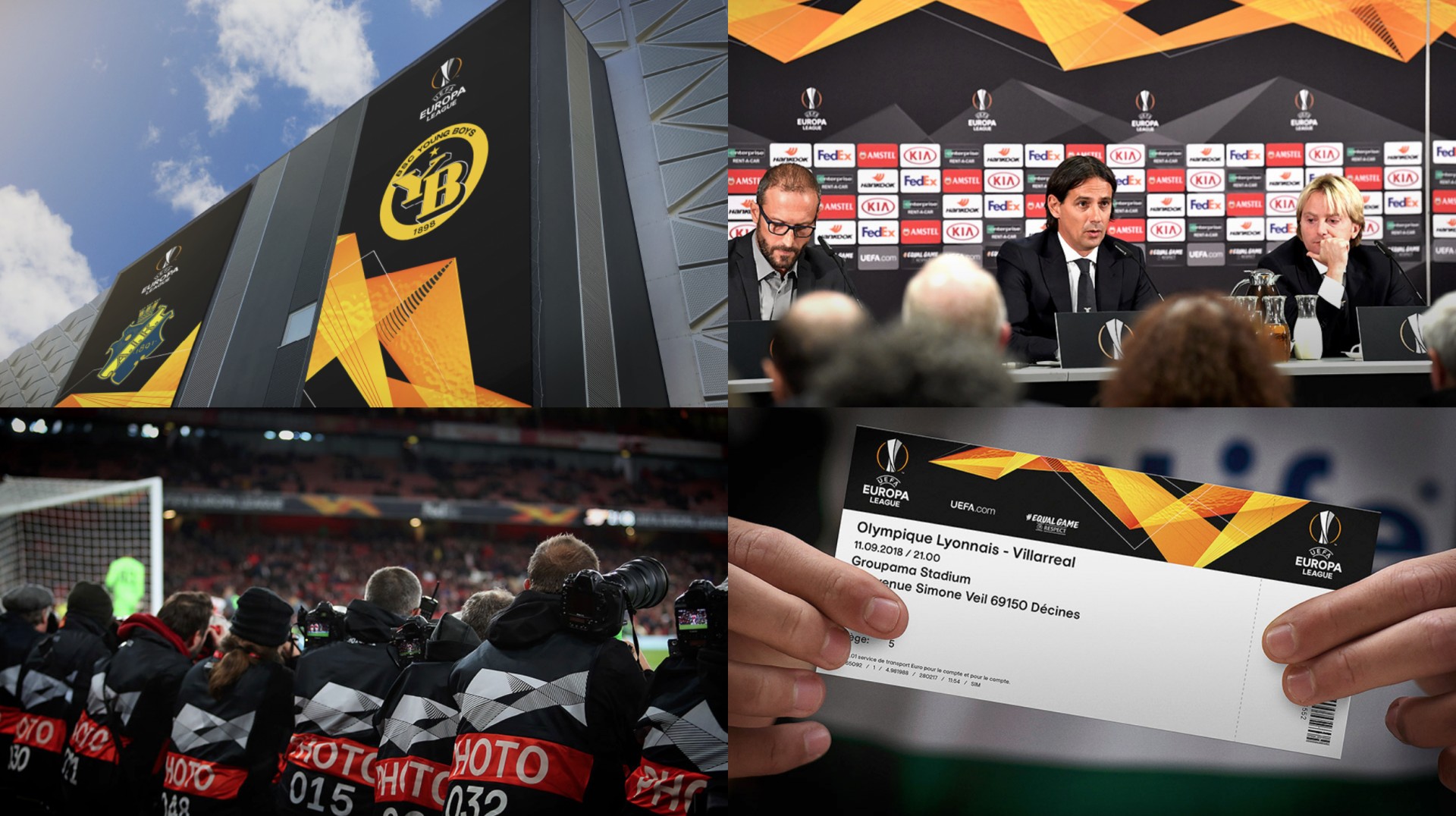
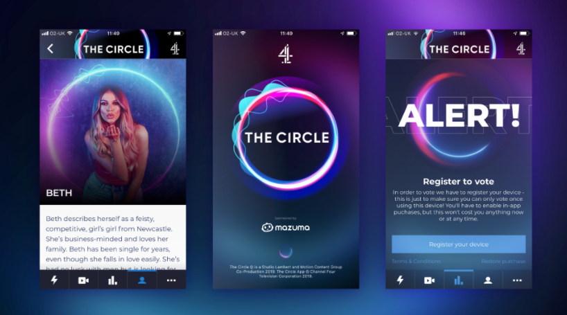
Esports Insider has collaborated with London-based branding agency, Turquoise Branding, to explore the cardinal rules of branding and how they apply to esports. The group has branded the likes of UEFA Europa League, game publishers Viker and MY.GAMES, and the UK’s reality-show hit, THE CIRCLE on Channel 4.
Digital natives and esports aesthetics
Esports has developed as a new sport, industry, and market simultaneously. Not to mention discovering its place in the symbiosis of gaming culture with the mainstream.
But, what brands are trying to do is nothing new, explained Gareth Mapp, Creative Director and Company Director of Turquoise. “The practice of branding goes back centuries and has evolved over many hundreds of years, but its core disciplines remain the same and will never change.”
Designing an identifiable mark that appeals to the target audience, for example, is fundamental to brand design, Mapp explained. It’s not a simple task. Brands operating digitally need to incorporate elements of audio, animation and interactivity that go beyond logotype. “You need an extended toolkit to work in [the online] environment,” Mapp warned.
This past year, esports stalwarts like Evil Geniuses and Dignitas have returned their identifying marks to their origins, selecting a modern update on their classic branding. North American League of Legends esports league, the LCS, underwent structural changes and chose a complete visual rebrand in January. Swedish org Ninjas in Pyjamas sought to revitalise its identity to better match what the org stands for in 2021.
Turquoise headed the rebrand of My.Games, which collated the branding of Mail.ru and My.com. Image credit: Turquoise / My.Games
Considering the growth brands have experienced over the years, the significance of their visual identity shifts as well. Today, many orgs do much more than compete in esports, and their brandmarks should reflect as such.
RELATED: How blue light blocking is playing an important role in branding, gamers health
The lion’s share of brand touchpoints are digital interactions between consumer and brand, through platforms like Twitter or Twitch. Outside of an extremely active social media presence using branded assets — modus operandi for platform growth — Mapp sees tremendous potential in conveying the values of a business to the audience through strong branding principles.
“Just looking at esports teams is fascinating,” Mapp told Esports Insider. “From a pure branding sense, it looks like [to me] what football teams were going through 150 years ago. Starting up these new badges, attracting the fans, getting the brand identity set — but because this is today, the look and feel of these brands is all today.
“The target audience is very young, so you get that sort of irreverent feel,” Mapp added, “with that sort of manga and comic book attitude and all. Which is cool, it’s really cool.”

Rebrands and personal branding
Rebrands might be useful for boosting social media vanity metrics, but they are often little more than adjustments to logotypes and brand marks — or the “shorthand of the brand,” as Mapp calls them.
As esports companies grow new arms of business, tournament operators move into new titles, and more non-endemic companies take the plunge into esports. To prepare for these brand extensions, rather than the ever-popular ‘esports rebrand’ route, businesses could benefit from well-thought-out branding processes to yield versatile and sustainable assets.
RELATED: David Fenlon: Brands need a different approach when advertising to esports fans
These changes, whether subtle or drastic, can be incredibly divisive within the community. Any rebrand can trigger mass Twitter exsibilation. Rapid rebranding also suggests that design choices are disposable rather than thoughtful.
All aspects of branding — particularly in the digital sphere — should be treated with care. Mapp used the example of Turquoise’s UEFA Europa League rebrand to illuminate this: “We created a massively versatile toolkit, almost a modular system, that allows for infinite variation in the identity.”

This multi-pronged approach allows the brand freshness of expression. More than pre-made designs, the system is a visual language to intuitively inform and delight viewers.
With their design philosophy, Turquoise puts great emphasis on creating distinctive, ownable visual languages for brands. “If you look at THE CIRCLE,” said Mapp, “it has a logotype, but that moving, animated circle is what we call a brand property. It gives a flavour, a more emotional and expressive feel to the brand.
“A good brand property is flexible — you can animate it, you can crop into it, you can be more playful with it than a logo. A logo is a badge that sits in the corner.”
A brand property allows an audience to identify the brand without needing to see its brandmark, name, or logotype. This vaporous element of branding is difficult to synthesise but its subtle omnipresence is what makes it so effective. DreamHack’s ‘warp’ expressed in its recent brand refresh is a good example.

Mapp recognised the depth of branding in esports. At a thousand yards, a fan can enjoy the sector as a whole, but with each shift in magnification the titles, leagues, teams, and players each reveal their own unique branding.
Larger-than-life personal brands like Rekkles, Doublelift, and Faker drive unique narratives through the drama of esports. Many pro players show affiliation to orgs they’re signed to on social media, while others choose not to. This can come down to a battle of strength between the player’s and the organisation’s branding; some individuals can carry a strong brand on their own.
RELATED: EXCEL ESPORTS unveils brand update with new logo and ‘Power of Better’ ethos
Esports brands can lead with innovative expressions of culture through content and branding. But some pages of this new-school playbook are likely copied from traditional sports, according to Mapp.
“This personal branding in sports all started with [Michael] Jordan,” Mapp said. “He became bigger than the team. Then what the Chicago Bulls did, which was quite clever, was they upped their game which attracted more star players, and then all of a sudden you have this huge global brand.”
Older and larger esports orgs have deeper roots to hold them steady against the gusts of trend and fan favour. All are navigating their branding in real time to accommodate rosters of diverse player histories, personal brands, and followings.
Plus, they should try to win a few games while they’re at it.
Created in collaboration with: Turquoise Branding
[maxbutton id=”11″ ]
