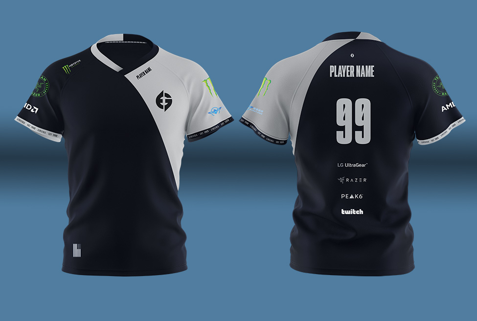
Update 21/05/20: The ’99’ featured on the back of EG jerseys is a placeholder and will be adjusted pending individual assignment to players.
Just six months after announcing a controversial rebrand that included a drastically new logo, North American organisation Evil Geniuses has taken a step back and tried again.
Esports Insider sat down with Nicole LaPointe Jameson, CEO of Evil Geniuses, to discuss the need to change the logo, as well as learnings that have been implemented into this “final phase” of the organisation’s rebrand.
RELATED: Evil Geniuses reveals ‘final phase’ of rebrand and LG UltraGear deal
“Rebrands are tough,” said Jameson. “Everyone has opinions but we’re pleased that our community has been excited for us to listen and integrate their feedback.”
When Evil Geniuses changed its original monogram logo to a wordmark in December 2019, it was originally part of a month-long effort to establish the organisation’s identity under new Peak6 Investments ownership.
“It’s no secret to anyone that knows how to use social media that the reception of the first wordmark phase was not great,” Jameson said. “We had a lot of learnings. We didn’t roll it out in a tasteful way [and] we didn’t give the right preface to all the pieces to come. We heard a lot of feedback that was really important for us to listen to and integrate.
“The first time around with the wordmark, it was too far away from the legacy and history component, and it took people by a very jarring surprise. [With the latest branding reveal] we made sure that the rollout was thoughtful and inclusive of all the elements that people really cared about,” she added. “A lot of that was making sure we were leaning into our legacy – remembering and paying homage to a lot of the history of EG when presenting a visual identity going forward.”
The new logo is more similar to the original, with a few minor changes to give it a modern look that translates onto digital platforms. The jerseys feature ’99’ on the back on honour of when Evil Geniuses was founded, in 1999.
RELATED: North CMO reflects on rebrand: ‘We definitely needed it’
Hardcore fans of Evil Geniuses might wonder why the logo had to change at all, Jameson explained that a change was necessary for two major reasons.
The first is that the original logo was only associated with Dota 2 but the organisation was ready to expand into other ventures. The second reason was that non-endemic partners “didn’t get it,” and the logo didn’t translate to different digital mediums.
“There were very functional design reasons why the old logo didn’t work,” she said, “but we needed something that tied into the legacy more than just the wordmark, so people could still recognise it. [We also needed it to] help us open doors that we needed to open so we can continue to be dominant for years to come.”
Alongside the new rebrand, Evil Geniuses announced a hardware partnership with LG UltraGear while “they had a lot of eyeballs on them,” Jameson said, adding that teasing the partnership directly with a new jersey reveal made sense.
“A monitor partner is obviously functionally helpful for an esports organisation but a partner like LG is exciting because it also encapsulates a lot of what our brand identity is trying to define. ‘Cutting edge, clean, and classic’ – those sentiments that we describe with our new visual identity – mirror what they look for as they expand in the esports space.”
[maxbutton id=”13″ ]