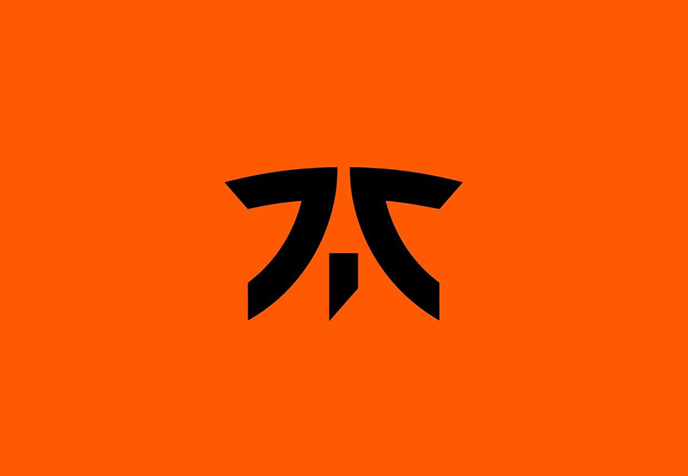
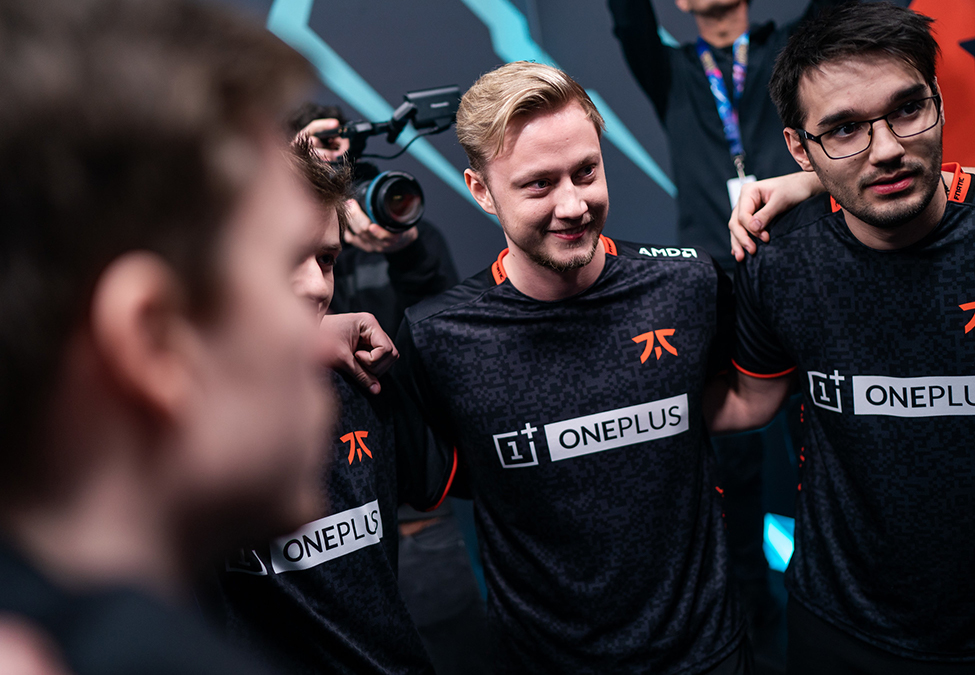
London-based organisation Fnatic has unveiled its new logo after spending days teasing a change on social media.
This is the third iteration of the organisation’s visual identity in its 15 years of existence.

RELATED: Evil Geniuses unveils organisational rebrand
The organisation’s new logo is described as a “simplified, cleaner, sharper” version of its predecessor, with the change being made in an effort to align it “visually with our new aesthetic as a brand.” It’s said to be more adaptable and translates well “from apparel to digital, hardware to in-game.”
Fnatic explained the decision behind the change in an announcement: “Now, it’s time to refine and update our identity and our purpose. To take us into a new decade, a new iteration of Fnatic in more than just colour and form. It’s time to sharpen up and evolve. Together, we will aspire to inspire a new generation. We will seek out, the rising, the upcoming and beyond; we will level-up our talent from zero to hero, and amplify them, to their rightful place as the stars of tomorrow.”

RELATED: LGD Gaming unveils rebrand at 10th anniversary celebration
New jerseys for the 2020 season were also unveiled as part of the brand refresh, with the alpha jersey coming in both black and orange variants.
Fnatic is partnered with the likes of OnePlus, AMD, LeTou, Rivalry, ViewSonic, and PCSpecialist. It competes in League of Legends, Counter-Strike: Global Offensive, Dota 2, Rainbow Six Siege, Fortnite, FIFA, Apex Legends, and PUBG Mobile.
Esports Insider says: After a slew of rebrands in the esports industry in recent months, Fnatic’s attempt seems to be the best-received for quite some time. We’ve seen the likes of North, LGD Gaming, and Evil Geniuses change up their visual identity recently, too.
[maxbutton id=”4″ ]
