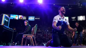
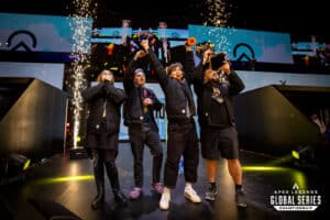
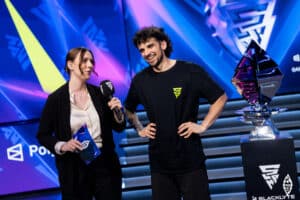
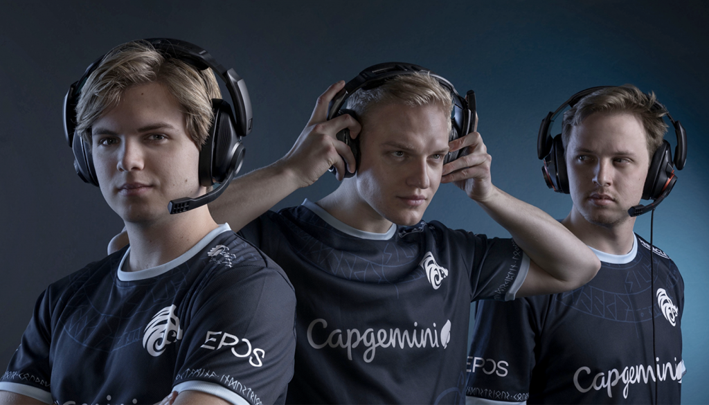
Nordic esports organisation North announced a slew of dramatic changes in January that included a revamped logo design and retooled organisational strategy.
The announcement came nearly three years to the day that North was founded as an esports affiliate of F.C. Copenhagen. Despite a strong run of team acquisitions and brand partnerships, the rebrand occurred because of “critical elements” that needed to be addressed at the “very foundation of the organisation.”
Alexander Mørch Pedersen, Chief Marketing Officer for North offers a deeper look into the rebrand and why he knew it needed to go further than just a new logo.
Since its conception, North has gained strength in numbers both in terms of competitive titles it participated in and strategic partners. After three years, however, the organisation began to have an identity crisis.
“For North, the question was never if but when we had to do a rebrand,” said Pedersen. “The organisation had been through so many changes in it is relatively short lifespan but no one ever really stopped and thought about what we, as an organisation, wanted to stand for, how we wanted to be perceived, and how we were to interact with our community in the long run.”
It all came down to creating an identity that was more than just about winning.
“When I started to look at the organisation from the outside in, it was pretty evident that […] we were lacking history and creating a ‘why’ we were supposed to be around,” said Pedersen. “We need to create great teams, but we need to create even better stories, better business, and make people ‘hear the roar.'”
RELATED: North hires Graham Pitt as Head of Esports Operations
Once it was decided that a rebrand was necessary, Pedersen and the rest of the North team spent three months making sure they had the right skeleton crew to make it happen.
“I don’t think people are aware of this, but we are not a big organisation,” he noted. “We have great owners, but we are a relatively small organisation with a limited budget compared to most of the top 20 organisations. So once we had people in place and did our due diligence in terms of our changes, we set everything up for launch.”
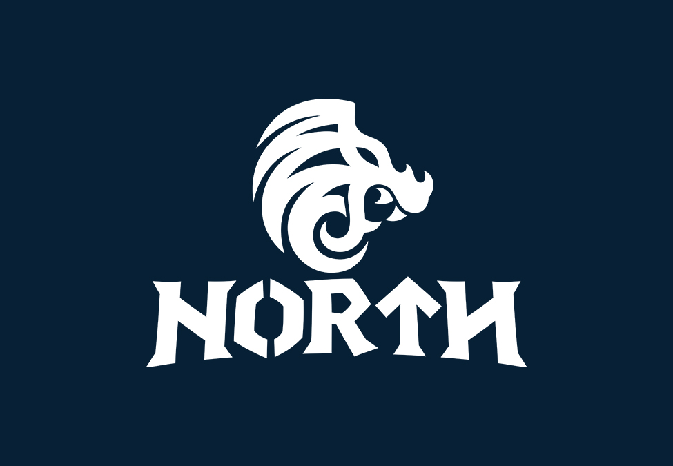
The new logo utilises North’s iconic lion head presented in a more aggressive, Viking-like style. Runes and rune-like fonts have also become integral to the organisation’s brand messages across its website and social channels. Pedersen says he knew they would a certain amount of pushback for the logo change. However, it was important to him and his team that North’s closest community understood the reasoning behind a rebrand and what the organisation wanted to stand for, including its Scandanavian heritage.
RELATED: North stocks up with Nocco partnership
Marketing is storytelling and the most important thing to consider when rebranding, Petersen said, has been to avoid telling too much at once.
“You have to let it unfold and explain later,” he explained. “We have so many parts of the rebrand that haven’t been unfolded yet – it’s something that we all really want to deliver on but when your organisation is our size, we just have to take more time to deliver and then make sure it is done correctly.”
Everything in that message has to be “on brand” and be relevant to the overarching plan for North, Pedersen added.
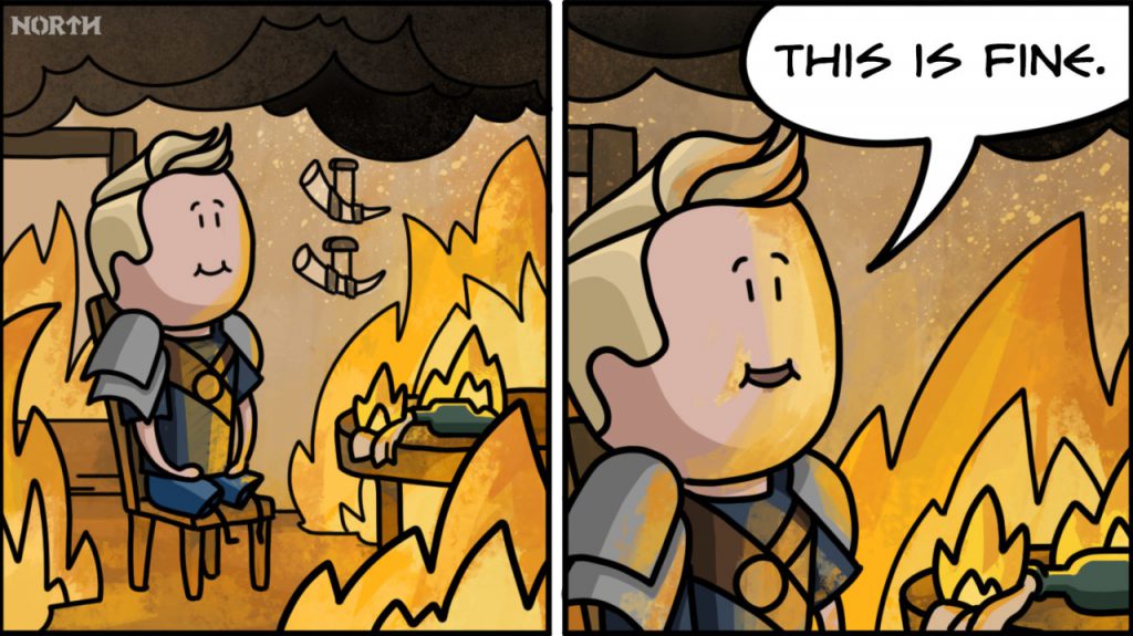
One way that North tells its stories is through cartoon Viking characters that represent the teams’ commitment to victory without losing the sense of fun that gaming provides.
“We wanted to make sure we spoke to the community via our own cartoon universe both the fun meme-ish universe and our more seriously stylized storytelling,” said Pedersen. “We wanted to make sure that we introduced our brand identifiers: Courage, Endurance, and Ambition.”
“Our biggest challenge hasn’t really been the exposure we got for the change – it has actually been keeping on point throughout the rollout, being able to produce enough great content, and not take the easy way out,” said Pederson. “An example could be choosing to do a meme and draw it in our style rather than use it exactly like everyone else and get it out faster. It is so tempting just to get it out there but when you do and it is uniquely yours – branded and synonymous with North – it is so much more valuable.”
Reflecting on the rebrand process thus far, Pederson says it is still very much ongoing.
“We definitely needed it and we have a ton of work to do yet,” he said. “It is a process that takes years and everyone in the organisation is part of the change from content through to management and players.”
[maxbutton id=”11″ ]