When you operate one of the longest-running and most recognised organisations in esports, the last thing you want to do is disregard your past. So when London-based organisation Fnatic unveiled a new logo in January — the third iteration in 15 years — the change wasn’t dramatic.
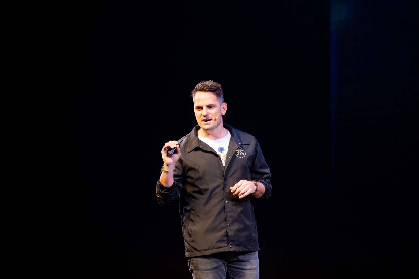
Unlike a few other notable rebrands in esports recently, Fnatic’s logo has remained largely unchanged, opting instead to streamline while keeping the existing colour scheme and familiar shapes intact. This, Fnatic CEO and Founder Sam Mathews told Esports Insider, is because, “a rebrand has to be an iteration and step forward — not be a rewrite.”
The biggest challenge of a new logo reveal like this, he added, is to do the legacy of the brand justice.
“You’re changing something that is well-loved and holds significance to our fans. You have to do it respectfully.”
On the technical side, a simplified logo allows a brand to consider how it will be placed in both digital and tactile worlds from websites and social media accounts to jerseys and other merchandise. It all has to be instantly recognisable, while easy to reproduce.
[primis_video widget=”5183″]
“We’ve had a 15-year run in esports and so for us, the brand is extremely important to what we’ve built,” said Mathews. “The [Fnatic] brand has kind of gone through three phases — the first was a hand-written logo designed out of all the letters of the phonetic word. [That] got refined around six years later or so to bring it into a more modern aesthetic — ultimately something that represented us.
“Then, with the culmination of this new rebrand, it was really just a time for us to think about what Fnatic is going to be for the future and where we go for the next 15 years. That was about another refinement — simplifying and cutting down to the core DNA of what Fnatic is about.”
Part of that, he said, is establishing and acknowledging Fnatic’s London heritage while representing esports as a global organisation. The new, streamlined Fnatic logo, for example, is prominently displayed on a limited edition Gucci Dive watch, which sold out in less than 48 hours despite the £1,150 ($1,416) price tag.
“As we’re reaching wider audiences we wanted to tighten up our brand,” explained Mathews. “We want to be iconic and stand up against globally recognised brands.”
The response from fans has been positive, Mathews said, reinforcing his team’s decision to simplify the logo without changing its essence.
“Ultimately we have a duty — as a team that has such a strong legacy — to stick to the core of what the fans have invested their time, money, love and effort into. For us, it’s not just about what’s going to look good or hold up in the future,” he said. “It’s also about the roots and so when we came out with the new logo and the colour refresh, it wasn’t a rebrand per se — it wasn’t a complete overhaul, but rather a refinement.
That’s why we call it an edit, not a rewrite. Because we don’t want to rewrite our history —we acknowledge our history and say it’s about the future as well.”
[maxbutton id=”4″ ]